COO RNA-sequencing - DESeq2
Michal Mokry - adapted by John Meeuwsen and Fleur Wallis
February, 2025
In this COO, you will perform a part of the analyses for RNA
sequencing, including:
1. Reading and exploring RNA seq data
2. Quality control
3. Run differential gene expression analyses
4. Visualize the results
5. Perform pathway analysis
This COO is adapted from https://www.bioconductor.org/packages/release/bioc/vignettes/DESeq2/inst/doc/DESeq2.html.
This COO uses DESeq2 package. You can install it by starting R and entering:
# You should have installed the BiocManager and DESeq2 earlier. If not, use the code below, remove #.
# If you're asked to update packages (all/some/none [a/s/n]), type n in the console.
# install.packages("BiocManager", dependencies = TRUE)
# BiocManager::install("DESeq2", dependencies = TRUE)
# Load the DESeq2 library
library(DESeq2)To make sure p-values will be displayed correctly, we will change the scientific notation:
options(scipen = 999)1. Read and explore dataset
The RNA samples were isolated from peripheral neutrophils of healthy donors and children with active arthritis. Even though the inflammation is restricted to the joints, we hypothesized that also peripheral blood cells (those in the circulation) might be activated. Is this the case? If yes, which pathways are upregulated? The raw datasets are already mapped and processed into a gene count table with the raw gene counts. We will compare the peripheral blood cell transcriptomes of healthy controls vs. young patients with active arthritis to test the hypothesis.
1. Formulate the research question. Specify the determinant, outcome measure and domain.
# First, set your working directory! The working directory is the directory where your raw files are located.
# Click session >> Set Working Directory >> Choose Directory.# Now, read the raw gene counts table. Note the argument 'row.names = 1'.
rawCounts <- read.table(file = "COO-RNAseq/NEU_raw.txt", header = TRUE, row.names = 1)2. How many samples are in the raw data? Are they in the right format? How can you check that?
In this count table, each row represents an Ensembl gene, each column a sequenced RNA library, and the values give the raw numbers of sequencing reads that were mapped to the respective gene in each library.
3. How many genes are present in this dataset?
4. What were the first 6 gene names? Remember how to access the names of the rows.
Next we need to include the sample/phenotypic information for the experiment at this stage.
5. Read the TSV file “NEU_metadata.txt” from your
working directory. Store it into a new object, called
metaData.
6. Explore the metadata, are they in the same order as the samples in your raw count table?
2. Per Sample Quality control
Before we start with the actual analysis, we explore the number of reads per sample or the sequencing depth. Commonly reads are converted to million as you order sequencing depth in millions at your sequencing facility. Unequal distribution of reads over the samples can indicate some technical issues in the sample preparation or sequencing. These samples should be removed from the analysis.
# convert raw transcript counts to million reads per sample
million_reads_sample <- colSums(rawCounts)*1e-6

million_reads_sample <- apply(rawCounts*1e-6, 2, sum)

# Sequencing depth per sample
barplot(million_reads_sample,
        names = colnames(million_reads_sample),
        ylab = "Reads per sample (millions)")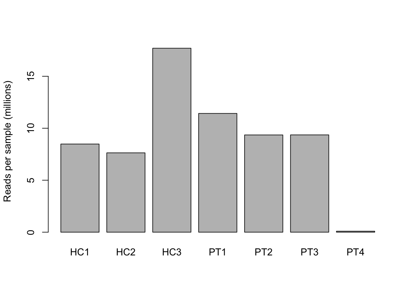
Many genes have low or zero expression (transcripts). Although these genes are in the genome, the transcripts are not expressed in our experimental conditions. In this case, not in the blood cells we are studying.
# select genes with at least one read
n_genes_nonzero <- rawCounts > 0
# count the number of genes with at least one read per sample
n_genes_nonzero <- colSums(n_genes_nonzero)

barplot(n_genes_nonzero,
        names = colnames(n_genes_nonzero),
        ylab = "number of genes with at least one read per sample")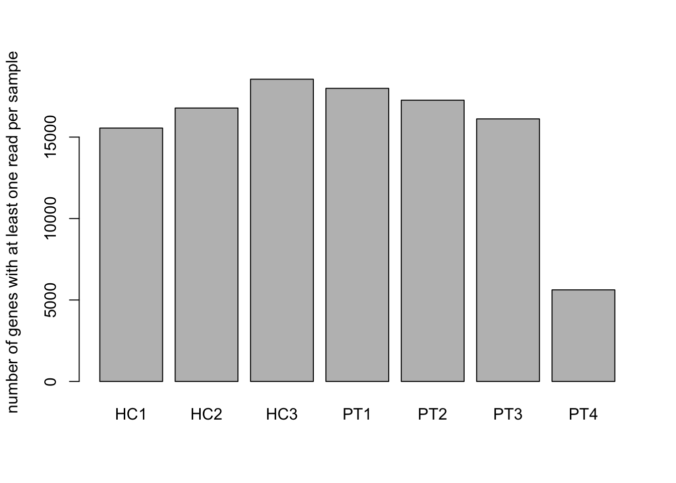
Look at the barplots you just created.
7a. How deep were the samples sequenced?
7b. What is the number of transcripts per sample that have at
least 1 read.
7c. Can you also show the sequencing depth when using the
function apply() instead of
colSums()?
8. Can you plot the number of transcripts with at least 10 reads per sample?
Zero transcripts are not informative and can be removed from the counts. However, zero is perhaps too low. We increase the filter transcripts with low expression. For example, 10 reads per transcript per sample.
The ‘PT4’ sample seems to have too few reads, and therefore probably is a bad sample. It would be best to remove it.
9. Store the dataframe without PT4 in the object
rawCounts_selected. Also remove PT4 from the
metaData and store the resulting dataframe in the object
metaData_selected.
Furthermore, there are a lot of transcripts with low to zero expression in both the healthy control and patient samples. These transcripts don’t contain any useful information, as they’re absent in both populations. We therefore remove them from our analysis. In the following code we remove these transcripts. We filter out the transcripts that are not expressed in at least 3 samples.
10. Explain why analysis of transcripts with zero gene expression will presumably not find differentially expressed transcripts. Exclude transcripts that are not expressed in 50% of your samples using the code below.
# Select genes with non-zero expression in at least three samples
rawCounts_final <- rawCounts_selected[rowSums(rawCounts_selected > 0) > 3,]

head(rawCounts_final)
After cleaning the dataset, we now examine whether transcript count distributions are comparable across samples. Since transcript counts follow a non-linear distribution, we apply a log₂ transformation to improve interpretability (easy to see and understand). We will visualize the distributions both before and after transformation.
Note 1: The log transformation is applied to the transcript counts after adding a small offset (1) to avoid log transformation of zero values, which is mathematically impossible. This offset is called a pseudo count.
Note 2: This is for visualization only as DESeq2 only accepts raw counts.
# Visualize gene count distribution, specify the label of the y-axis.
boxplot(rawCounts_final * 1e-3,
        ylab = "Transcript counts (10^3) per sample")

# Visualize gene count distribution with data transformation.
boxplot(log2(rawCounts_final + 1),
        ylab = "Log2(Transcript counts) per sample")
The boxplots shows that transcript distributions is not equal across samples. For differential gene expression a similar distribution is important. Lucky for us, the DESeq2 package will perform this normalization automatically. We will see the results of the normalization later during the practical.
Note: normalization is different from transformation. Normalization is a method to adjust the transcript counts for sequencing depth to compare gene expression between samples. Transformation is a method to change the distribution of the gene counts to a normal distribution.
- Sequencing depth: number of reads per sample
- Normalization: adjust the number of reads per sample to make them comparable
- Transformation: change the distribution of the transcript counts (reads) to a normal distribution (in this case)
11. Why is normalization necessary for DE analysis, and what are important factors to account for?
3. Run differential gene expression
Finally, we are ready to run the differential expression pipeline. First we need to prepare the data object.
dds <- DESeqDataSetFromMatrix(rawCounts_final, # first argument
                              metaData_selected,  # second
                              formula(~ group))   # third
Note: Multiple transcripts exist for each gene. Therefore we used transcript and reads interchangeably in the last section. However, from now on we will say gene instead of transcript.
12. Explain which arguments are used in the
DESeqDataSetFromMatrix() function above.
Optional: use the manual vignette("DESeq2").
The DESeq2 analysis can now be run with a single call to the function DESeq. This might take few seconds or even minutes depending on how large is your dataset.
dds <- DESeq(dds)After normalisation, we can inspect the transcript count distributions across samples. DESeq2 normalises transcript counts for sequencing depth, making samples comparable, but it does not transform counts to a normal distribution. We can visualize the normalised counts with regularized log transformation by DESeq2 through the rlog function. The rlog-function does a little bit more than a simple log2 transformation. For now, this is not important.
# Log-transform normalised counts
rlog_counts <- rlog(dds, blind = TRUE)
# retrieve the counts
rlog_counts <- assay(rlog_counts)
# Boxplot of log-transformed transcript counts
boxplot(rlog_counts, ylab = "Log-transformed Transcript Counts")From this plot, we see that the distributions are now more comparable between samples.
Next, we examine the results from the differential gene expression analysis. We go back to the original counts, as the rlog transformation is for visualization.
# extract the results from the differential gene expression analysis
res <- results(dds)
res
13. What does the result look like? Explain what you see in each column and row.
In the code above, we have obtained a table of genes that included the adjusted p-values, which were calculated using Benjamini-Hochberg.
We have a few genes with NA values, these have to be removed for further analysis.
14. Order the results of ‘res’ by adjusted p-value and assign them to the object ‘res_ordered’.
# First the NA's in the column with adjusted p-values need to be removed
res_ordered <- res[!is.na(res$padj),]

# Add code to order the data by adjusted p-value
15. Use the command below to create a matrix with differentially expressed genes. How many genes are differentially expressed with an adjusted p-value < 0.05?
# select all genes with a p-value lower than 0.05
sig <- res_ordered[res_ordered$padj < 0.05, ]
head(sig)
nrow(sig)
Ordering and filtering can be combined. Use the following code to obtain the differentially expressed gene matrix, based on adjusted p-value < 0.05 and absolute log2 fold change above 1.
# note filtering and ordering can be combined
# also not the abs() function to get the absolute value
sigfc <- res_ordered[res_ordered$padj < 0.05 & abs(res_ordered$log2FoldChange) >= 1,]
sigfc
nrow(sigfc)
16. How many differentially expressed genes are there with at least a 2-fold expression change?
4. Visualize the results
17. Now we can plot the MAplot to explore the results. Does this MA-plot look good? Why (not)?
# Visualize all genes, the differentially expressed genes are depicted in blue.
plotMA(dds, ylim = c(-10,10))Note: We will use the %in% operator, see the example below. For those who want to know more: http://www.datasciencemadesimple.com/in-operator-in-r/
# Example of %in% operator

c(1,2,3,4,5) %in% c(3,5)
18. Explain how the %in% operator works.
19. Create a heatmap from the differentially expressed genes using the code below.
Beyond visualization, log-transformed counts are also useful when comparing gene expression levels across samples. A heatmap visualizes similarities in expression patterns between samples and genes. We will use the DESeq2 normalized and log-transformed counts. We done this earlier with the rlog function. We select the signficant genes we found earlier.
# Select gene names of differentially expressed genes.
sig_genes <- rownames(sigfc)

# For the heatmap, we need log-transformed counts
rlog_sigs <- rlog_counts[rownames(rlog_counts) %in% sig_genes,]
head(rlog_sigs)
## HC1 HC2 HC3 PT1 PT2 PT3
## ENSG00000000938 13.440324 13.583308 13.793395 14.512167 14.068083 14.325704
## ENSG00000002933 3.204667 2.944482 2.059308 3.327362 4.030285 5.482422
## ENSG00000003393 6.508575 6.640400 6.849395 5.735125 6.065596 5.973186
## ENSG00000003400 7.767410 7.719798 7.673055 7.988316 8.495820 8.877036
## ENSG00000005302 9.777851 9.921226 9.831026 11.498456 11.547449 11.046423
## ENSG00000005379 6.243521 6.176518 6.080123 6.789070 7.498644 7.163910# Select colors for the heatmap and plot the heatmap for the selected genes.
hmcol <- topo.colors(100)
hmcol <- colorRampPalette(c("darkgreen","yellow", "red"))(n = 100)
# Code to plot the heatmap of the significantly differentially expressed transcripts.
heatmap(rlog_sigs, col = hmcol, scale = "row")
# Change the scale from "none" to "row", what happens?20. The rlog-function of DESeq2 also adds a pseudo-count, a small increment value before log-transforming. Why is this necessary?
About 8% of males and 0.5% of females is color blind and has difficulties to distinguish red from green. They will have a hard time to clearly interpret the heatmap above.
21. Change the colors in the heatmap to the color blindly friendly RcolorBrewer palette ‘RdBu’ using the code below. Add a legend by adapting the provided code after the #.
library(RColorBrewer)
hmcol <- RColorBrewer::brewer.pal(9, "RdBu")
hmcol
heatmap(rlog_sigs,
        col = hmcol, # change the color palette
        scale = "row" ) # change the scale to row, as before
legend(x = "topleft", legend = c("low", "medium", "high"), cex = 0.8, fill = c("#B2182B", "#F7F7F7", "#2166AC"))
21. Plot only genes with absolute log2 fold change of > 6
and padj < 0.01. Store these genes in an object
sigfc6.
5. Pathway analysis
22. Write the significant results with an absolute fold change > 1.5 and adjusted p-value < 0.05 to a comma delimited file (csv), using the code below.
# Select dataset with differentially expressed genes (absolute FC > 1.5 and adjusted p-value < 0.05).
sig <- res_ordered[res_ordered$padj < 0.05 & abs(res_ordered$log2FoldChange) > 1.5,]

# Write the results to a text file. It will be automatically stored in your working directory.
write.csv(as.matrix(sig), file = "COO_RNAseq_DEgenes.csv")
24. Perform Pathway Analysis
- Open the file in Excel (Data > Import > From Text/CSV — Dutch: Gegevens > Importeren > Van text/csv).
- Copy the transcript list and paste it into ToppGene (https://toppgene.cchmc.org/enrichment.jsp).
- Identify the top 3 significantly enriched pathways.
25. What are the top 3 pathways, and how do you interpret the results?
Summary
In this practical, you performed RNA-sequencing differential expression workflow:
- Loaded and cleaned transcript count data
- Performed quality control and visualisation
- Ran DESeq2 analysis and identified differentially expressed transcripts
- Generated an MA plot and heatmaps for interpretation
- Explored what pathways were affected by your differential expression
RNA sequencing provides a powerful approach to exploring transcript expression in different conditions. This tutorial covered the essential steps in a DESeq2 pipeline, but remember:
- Visual inspection of raw count on the level of sample and genes.
- Transforming counts with a log-transformation is useful for visualization.
- Normalization by DESeq2 is necessary before comparing samples as they have differing number of reads, this is done automatically.
- RNA-sequecing has many other applications beyond differential expression analysis!