Introduction
Today, you will analyse genotype data and perform a genome-wide association study (GWAS). With a GWAS we aim to find variants/SNPs that are associated with a disease or trait of interest. In a nutshell it means, we compare allele frequencies of patients (cases) and controls and hope to find SNPs that have a higher (or lower) frequency in cases compared to controls.
Since we have limited time for this practical, we will focus on a subset of the analyses. Although it will give you an indication what a genetic analysis consists of, it is by no means a complete picture and therefore cannot be used as a protocol for real data. These steps were performed beforehand using the tool PLINK. PLINK is a bioinformatic tool for analysing genotype and phenotype data. You will be analysing the output of these steps and interpret it. The log files of these steps are available in the same folder as this tutorial.
Today we will focus on the following parts:
- Visualising the data / Quality control (QC):
- Missingness
- Allele frequency
- Basic QC
- Inbreeding
- Population outliers
- Missingness
- Running a GWAS:
- Chi-square test
- Logistic regression
- Chi-square test
If you would like to know more about PLINK or execute the steps
yourself, check out the website: http://zzz.bwh.harvard.edu/plink/index.shtml. The usage
of PLINK consists of:
1. Giving the input data
2. Performing an action (describing, filtering, analysing data)
3. Retrieving and checking output
For this tutorial we will be using data from a study in Amyotrophic lateral sclerosis (ALS) consisting of 3488 individuals (1338 patients and 2150 controls) and 711,202 SNPs. Please note, some adaptations to this dataset were applied to make it more suitable for this course.
Q1: Formulate a research question relevant to this study.
Another remark: For this tutorial, the ‘old’ version of PLINK was
used (1.07), see website above. Because both the website and the log
files are (I think) more clear and user-friendly.
However, if you will be analysing large datasets, we recommend using the
new version: PLINK 1.9 (or 2): https://www.cog-genomics.org/plink2 since it’s much
faster.
Quality control and visualising the data
Recall that SNPs/genotypes are stored in ped+map files. A ped file contains the sample information (see below, the first 6 columns: Family ID, Individual ID, Paternal ID, Maternal ID, Sex (1=male; 2=female; other=unknown), Phenotype), followed by the genotypes (per SNP 2 columns (one for each allele), whereas the map file contains info about the SNPs (chromosome, SNPid, centimorgan (cM) position, base-pair (BP) position).
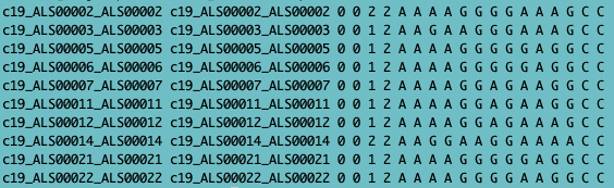
Fig. 1 - ped file
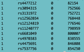
Fig. 2 - map file
The first step after retrieving ped+map files is to create binary files, which are compressed files, and much faster to work with. This is done with the PLINK command (don’t run this in R, it won’t work):
plink --file sNL4 --make-bed --out sNL4 --noweb
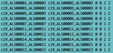
Fig. 3 - fam file
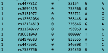
Fig. 4 - bim file
This creates the following files:
- .fam (first 6 columns of the ped file),
- .bim (the map file with alleles added),
- .bed file (compressed/binary file), which you can’t read/open.
You can open the log file by clicking, (it will open in a new tab), or with a text editor of your choice, to see what PLINK did:
It will first show information about the software/version followed by the parameters that were specified. Then a bunch of lines are printed with details about the data (describing individuals and SNPs). Last, it will show to which files the output is printed.
Missingness
Now that we have binary files, we are interested whether all samples have been genotyped well. Therefore we will look at the call rate or missingness. The PLINK command
plink --bfile sNL4 --missing --out sNL4m --noweb
will output a file with missing frequencies per individual (.imiss)
and per SNP/locus (.lmiss). (Check out http://zzz.bwh.harvard.edu/plink/summary.shtml#missing.)
Also check out the log file
sNL4m.log. You cannot
run this code in R.
Let’s have a look at the file sNL4m.imiss.
(Tip: If you open R(Studio), by default you are in your home directory.
This is usually not the folder where your data of interest is. To change
the ‘working directory’, click: session >> Set Working Directory
>> Choose Directory (shortcut:
Ctrl+Shift+H).
setwd("~/path/to/files")Load data in R.
miss <- read.table("sNL4m.imiss", header = TRUE)Q2: Take a look at the file. What do the columns represent? (Hint: you may want to use the PLINK documentation)
Q3: What is the sample with the highest missingness?
Now, plot the frequency of the missingness
hist(miss$F_MISS, breaks = 100, col = "darkgreen", main = "Missingness per sample", xlab = "Missingness")It’s a bit hard to see due to the peak at the left. Therefore we will zoom in a bit (only selecting a subset of samples with a missingness > 0.05).
miss2 <- subset(miss, miss$F_MISS>0.05)
hist(miss2$F_MISS, breaks = 50, col = "darkblue", main = "Missingness per sample", xlab = "Missingness")
You can see that quite some individuals fall outside the 5% (0.05) threshold that is common in GWAS-land. We will remove these samples later.
Allele frequency
We are interested in the distribution of the allele frequencies to
see how common or rare the SNPs in our dataset are.
The minor allele frequencies (MAF) were calculated with the PLINK
command:
plink --bfile sNL4 --freq --out sNL4f --noweb
which outputs the file sNL4f.frq. (Don’t run this in R.) Check out http://zzz.bwh.harvard.edu/plink/summary.shtml#freq
Explore the logfile: sNL4f.log in a text editor or click to open a new tab, to see what was executed.
Now read in the file sNL4f.frq and look at the data:
# Add command to read in the sNL4f.frq file into RStudioShow the first lines of this file.
Q4: Describe the columns. What do they represent?
Now make a histogram of the MAF (remove ‘#’ before running):
#hist(frq$MAF)Q5: Now make a histogram and make it look more pretty (use a color, give it a title and name the x-axis (you can add more if you want)):
Q6: What do you notice if you look at the minor allele frequencies (MAF)?
Q7: Explore the dataframe. What is the highest MAF and what is the lowest MAF?
Q8: What’s the reason that this max frequency is the highest frequency and there are no SNPs with a higher allele frequency?
Basic QC
Next, we performed a basic QC on the data (excluding individuals and
genotypes >5% missingess and genotypes with a MAF<1% or
HWE<1e-4 in PLINK (don’t run in R):
plink --bfile sNL4 --mind 0.05 --geno 0.05 --maf 0.01 --hwe 1e-4 --make-bed --out sNL4_qc --noweb
For more information about the parameters, see http://zzz.bwh.harvard.edu/plink/thresh.shtml.
The –mind command is to remove individuals with many
missing SNPs. Of the 3488 samples 58 have a missingness > 5%.
–geno 0.05 removes SNPs that are missing in more than
5% of the individuals. This is because a SNPs that is not called
(correctly) in a substantial amount of the individuals, the quality
might be off and we can’t trust the results of the GWAS.
A minor allele frequency (MAF) cut-off of 1% is used to
remove very rare SNPs (that don’t have enough power to give a signal).
The reason we normally include this step in QC is because to QC the
individuals we want to use common SNPs (for calculating principle
components (PCs) for example) because rare SNPs are not present in many
samples and therefore are not very informative when comparing samples.
Note: we also plotted the MAF in Q3-Q8.
The Hardy-Weinberg equilibrium (HWE) threshold is
included because we want our SNPs to meet the Hardy-Weinberg
equilibrium, which means the proportion of the alleles (AA/AB/BB) are
constant over generations. We don’t have time to go into detail and you
don’t have to know the principle (at least for this HC/COO) but if you
want to know more about it, check out your friend Google.
Q9: How many individuals and SNPs have failed this step? Explore the sNL4_qc.log file.
With this cleaner file, we will look at the hetero- and homozygosity of the individuals. Because if individuals have much more heterozygous genotypes than expected, this might be an indication for sample contamination or sample mix-up. On the other hand, if samples are too homozygous, this could be due to inbreeding (population isolate). Because this might affect the analysis, we want to remove those samples.
Inbreeding
With plink you can calculate the inbreeding coefficient (again, don’t run in R):
plink --bfile sNL4_qc --het --out sNL4_h --noweb
Also see http://zzz.bwh.harvard.edu/plink/ibdibs.shtml#inbreeding
Load in this data and look at the file:
hets <- read.table("sNL4_h.het", header = TRUE)Q10: Show the first lines of this file.
Q11: Which fields/columns are in there?
Now make a plot:
hist(hets$F, breaks = 100, col = "purple", main = "Inbreeding coefficient", xlab = "F statistic")To know what threshold to use in identifying failing samples, we calculate the standard deviation (SD) of the F statistic. Samples that exceed three times the SD from the mean, will be excluded from further analyses. Samples that are too heterozygous (sample contamination, sample mix-up) have an observed homozygosity that is less than expected (negative F value). Samples that are too homozygous (inbreeding) have an observed homozygosity that is more than expected (positive F value).
## Calculate sd and multiply by 3, and calculated the mean of the F statistic
stdev <- sd(hets$F)
stdev3 <- sd(hets$F)*3
avg <- mean(hets$F)
## Determine lowerlimit
F_min <- avg - stdev3
## Determine upperlimit
F_plus <- avg + stdev3
## Create subset with failing samples
hets_fail <- subset(hets, hets$F < F_min | hets$F > F_plus)
## In order to remove those samples using plink, we need to export a file with the failing IDs in it
## First, select first two columns
hets_fail2 <- hets_fail[,1:2]
# Write them to a file
write.table(hets_fail2, file = "hetfail.txt", row.names = FALSE, quote = FALSE, sep = "\t")
Q12: What are the lower and upper thresholds that we filter the samples on?
Q13: How many samples have failed? Explore the sNL4_qced.log file.
With PLINK we have removed these samples (don’t run in R):
plink --bfile sNL4_qc --remove hetfail.txt --make-bed --out sNL4_qced --noweb
Population outliers
The final QC step for now is to look at population outliers. Therefore we will create a principle component analysis (PCA) plot with princple components (PCs) that were calculated using PLINK. First, the dataset was merged with a Hapmap dataset (HM3), see the log file merged.log, if interested. This HM3 dataset consists of almost 1000 individuals from 11 populations. Then we performed a clustering to calculate principle components (PCs):
plink --noweb --bfile merged --cluster --mds-plot 2 --out mds
(Don’t run in R.)
We only want to calculate 2 PCs, hence the ‘2’ in the command
above.
For more information, see http://zzz.bwh.harvard.edu/plink/strat.shtml
Create a PCA plot:
## read data
population <- read.table("merged.mds", header = TRUE)
Look at the first lines of this file:
head(population)## FID IID SOL C1 C2
## 1 ASW 2 0 -0.165535 0.0517437
## 2 ASW 3 0 -0.154202 0.0455280
## 3 ASW 4 0 -0.132021 0.0417673
## 4 ASW 5 0 -0.156775 0.0496217
## 5 ASW 7 0 -0.168653 0.0487473
## 6 ASW 8 0 -0.164422 0.0485939Split/subset the data per population:
## make subsets per population in order to give them seperate colours.
## This is based on the FID (1st column in the mds file)
population.CEU <- subset(population, population$FID == "CEU")
population.YRI <- subset(population, population$FID == "YRI")
population.CHB <- subset(population, population$FID == "CHB")
population.JPT <- subset(population, population$FID == "JPT")
population.ASW <- subset(population, population$FID == "ASW")
population.CHD <- subset(population, population$FID == "CHD")
population.GIH <- subset(population, population$FID == "GIH")
population.LWK <- subset(population, population$FID == "LWK")
population.MEX <- subset(population, population$FID == "MEX")
population.MKK <- subset(population, population$FID == "MKK")
population.TSI <- subset(population, population$FID == "TSI")
## Since 'our' dataset doesn't have an FID we can filter on (all individuals have unique FIDs), we simply say, if the FID is not one of the above, it belongs to our dataset. In most datasets FIDs of '0' are used)
population.sub <- subset(population, population$FID != "CEU" & population$FID != "YRI" & population$FID != "CHB" & population$FID != "JPT" & population$FID != "ASW" & population$FID != "CHD" & population$FID != "GIH" & population$FID != "LWK" & population$FID != "MEX" & population$FID != "MKK" & population$FID != "TSI")When using the code below, plot the populations line by line so you can see the different populations popping up clearly!
plot(population.CEU$C1, population.CEU$C2, col = ("darkorange"), xlim = c(min(population$C1),max(population$C1)), ylim = c(min(population$C2),max(population$C2)), pch = 19, xlab = "C1", ylab = "C2", main = "MDS plot")

points(population.YRI$C1, population.YRI$C2, col = ("darkgreen"), pch = 19)

points(population.CHB$C1, population.CHB$C2, col = ("darkmagenta"), pch = 19)

points(population.JPT$C1, population.JPT$C2, col = ("cadetblue"), pch = 19)

points(population.ASW$C1, population.ASW$C2, col = ("dodgerblue"), pch = 19)

points(population.CHD$C1, population.CHD$C2, col = ("deeppink"), pch = 19)

points(population.GIH$C1, population.GIH$C2, col = ("firebrick"), pch = 19)

points(population.LWK$C1, population.LWK$C2, col = ("chartreuse"), pch = 19)

points(population.MEX$C1, population.MEX$C2, col = ("darkorchid1"), pch = 19)

points(population.MKK$C1, population.MKK$C2, col = ("blue3"), pch = 19)

points(population.TSI$C1, population.TSI$C2, col = ("darkgoldenrod4"), pch = 19)

points(population.sub$C1, population.sub$C2, col = ("black"), pch = 21, bg = ("white"))

## add a legend to the plot (if the legend is very large or small (this can differ between computers), you can play with the cex value, see below).
legend("bottomleft", legend = c("CEU", "YRI", "JPT", "CHB", "ASW", "CHD", "GIH", "LWK", "MEX", "MKK", "TSI", "your_dataset"), fill = c("darkorange", "darkgreen", "darkmagenta", "cadetblue", "dodgerblue", "deeppink", "firebrick", "chartreuse", "darkorchid1", "blue3", "darkgoldenrod4", "white"), cex = 0.7)
The meaning of the abbreviations:
ASW African ancestry in Southwest USA
CEU Utah residents with Northern and Western European
ancestry from the CEPH collection
CHB Han Chinese in Beijing, China
CHD Chinese in Metropolitan Denver, Colorado
GIH Gujarati Indians in Houston, Texas
JPT Japanese in Tokyo, Japan
LWK Luhya in Webuye, Kenya
MEX Mexican ancestry in Los Angeles, California
MKK Maasai in Kinyawa, Kenya
TSI Toscani in Italia
YRI Yoruba in Ibadan, Nigeria
Q14: Which population do the individuals from our dataset belong to?
We will remove these outliers to prevent finding a signal due to population differences. We want to remove outliers that deviate more than 10 SD from the European sample. We first calculate the mean and SDs of the European Hapmap samples of the first two PCs (C1 and C2).
avgC1 <- mean(population.CEU$C1)
avgC2 <- mean(population.CEU$C2)
stdevC1 <- sd(population.CEU$C1)
stdevC2 <- sd(population.CEU$C2)
Multiply with 4 to get the SD that deviates 4x from the mean:
stdevC1_4 <- stdevC1*4
stdevC2_4 <- stdevC2*4
Calculate the lower and upper bounds for C1 and C2 (lower: mean - 4x SD and upper: mean + 4x SD):
C1_min4 <- avgC1-stdevC1_4
C1_plus4 <- avgC1+stdevC1_4

C2_min4 <- avgC2-stdevC2_4
C2_plus4 <- avgC2+stdevC2_4
Use these SD values to get the passing and failing samples resp.
population.sub.in4 <- population.sub[population.sub$C1 >= C1_min4 & population.sub$C1 <= C1_plus4 & population.sub$C2 >= C2_min4 & population.sub$C2 <= C2_plus4,]
population.sub.fail4 <- population.sub[population.sub$C1 < C1_min4 | population.sub$C1 > C1_plus4 | population.sub$C2 <= C2_min4 | population.sub$C2 >= C2_plus4,]
We want to color the samples based on failing of passing the outlier threshold.
plot(population.CEU$C1, population.CEU$C2, col = ("darkorange"), xlim = c(min(population$C1),max(population$C1)), ylim = c(min(population$C2),max(population$C2)), pch = 19, xlab = "C1", ylab = "C2", main = "MDS plot")

points(population.YRI$C1, population.YRI$C2, col = ("darkgreen"), pch = 19)
points(population.CHB$C1, population.CHB$C2, col = ("darkmagenta"), pch = 19)
points(population.JPT$C1, population.JPT$C2, col = ("cadetblue"), pch = 19)
points(population.ASW$C1, population.ASW$C2, col = ("dodgerblue"), pch = 19)
points(population.CHD$C1, population.CHD$C2, col = ("deeppink"), pch = 19)
points(population.GIH$C1, population.GIH$C2, col = ("firebrick"), pch = 19)
points(population.LWK$C1, population.LWK$C2, col = ("chartreuse"), pch = 19)
points(population.MEX$C1, population.MEX$C2, col = ("darkorchid1"), pch = 19)
points(population.MKK$C1, population.MKK$C2, col = ("blue3"), pch = 19)
points(population.TSI$C1, population.TSI$C2, col = ("darkgoldenrod4"), pch = 19)

## this is our own dataset:
points(population.sub.in4$C1, population.sub.in4$C2, col = ("black"), pch = 21, bg = ("white"))
points(population.sub.fail4$C1, population.sub.fail4$C2, col = ("red"), pch = 25, bg = ("yellow"))

## add a legend to the plot (if the legend is very large or small (this can differ between computers), you can play with the cex value, see below).
legend ("bottomleft", legend = c("CEU", "YRI", "JPT", "CHB", "ASW", "CHD", "GIH", "LWK", "MEX", "MKK", "TSI", "MFC_passing", "MFC_failing"), fill = c("darkorange", "darkgreen", "darkmagenta", "cadetblue", "dodgerblue", "deeppink", "firebrick", "chartreuse", "darkorchid1", "blue3", "darkgoldenrod4", "white", "yellow"), cex = 0.5)
Now we will create a list with all passing samples that we can extract from our dataset. Therefore, extract first and second column and write them to a file, in order to retain them with PLINK.
pop_ids <- population.sub.in4[,1:2]write.table(pop_ids, file = "Samples2keep.txt", quote = F, row.names = F, sep = "\t")These samples can be extracted with PLINK (don’t run in R).
plink --bfile sNL4_qced --keep Samples2keep.txt --make-bed --out sNL4_qced2
Check the log file sNL4_qced2.log.
Q15a: How many of our samples FAILED this PCA
step?
Q15b: How many samples in total have been excluded in this whole
quality control procedure?
Running a GWAS
Chi-square test
With PLINK you can do a GWAS. For info check http://zzz.bwh.harvard.edu/plink/anal.shtml.
The most basic test is the chi-square test (–assoc), which compares
allele frequencies between cases and controls.
The command is:
plink --bfile sNL4_qced2 --assoc --out assoc2a
(Don’t run in R.)
This will output a file called assoc2a.assoc and we will only focus on
the autosomes, so we created a subset with the autosomes and called it
assoc.txt
Let’s explore this file.
gwasResults <- read.table("assoc.txt", header = TRUE)Print the first few lines
Q16: What is shown here? Explain the columns (you can use the plink website).
Q17: How many SNPs were tested?
Since plotting this many data points is very slow, we will plot only
a subset.
This is done in three steps:
1. Take all the top SNPs (p-value < 0.0001)
2. From the remaining SNPs, take 50,000 random SNPs
3. Combine these subsets
- Select all SNPs with p < 0.0001:
p_sig <- subset(gwasResults, gwasResults$P < 0.0001)- Take 100000 SNPs from p > 0.0001 with the function ‘sample’:
p_NS <- subset(gwasResults, gwasResults$P >= 0.0001)
p_random <- p_NS[sample(nrow(p_NS), size=50000),]- Combine the two datasets with rowbind (rbind):
p_subset <- rbind(p_sig, p_random)Now, let’s make this awesome Manhattan plot and QQ plot you learned about to visualise the results and check the quality of the data. There is a very useful package for this, which is called ‘qqman’.
If you haven’t installed it yet, you can install it with:
install.packages("qqman")Load the library
library(qqman)Check out the manual.
vignette("qqman")In the Help section in the bottom right corner of Rstudio, the documentation will be displayed. quickly scan it, till you reach the “Manhattan” section.
Q18: With help of this documentation, create a Manhattan plot
and add some graphical parameters. Make sure you use the subset,
p_subset instead of gwasResults.
Q19: On which chromosome does the most significant hit live?
Order/sort the dataframe.
Q20a: What is the most significant p-value? Which SNP/rsid belongs to this p-value?
Now explore this SNP further.
Go to a public database, such as ENSEMBLE: https://grch37.ensembl.org/index.html.
Enter the SNP and look up to what disease this SNP is related.
Q20b: Does it make sense?
Use the UCSC browser (https://genome.ucsc.edu/cgi-bin/hgTracks?db=hg19&position=lastDbPos&pix=1405).
Enter the SNP, click on the top result and zoom out 20 times.
Q20c: Which gene region is most close to the SNP?
Search the gene in Google and look at diseases related to gene
mutations of this region.
Q20d: Is this a logical finding?
Q21: Now create a qqplot of the p-values from the p_subset (as explained in the manual).
Remember that the quality of the GWAS is expressed in the lambda
value.
Calculate the lambda:
pvalues <- na.omit(p_subset$P)
z1 <- qnorm(pvalues/2)
lambda1 <- round(median(z1^2)/qchisq(0.5,df=1),3)
Q22: What is the lambda? Would you call this a well-behaving GWAS or not? Explain why.
Let’s see if correcting for covariates, like age, makes a difference.
Logistic regression
In PLINK, you can, instead of a basic chi-square test, perform a logistic model. This means you can add more variables to the model than just a chi-square test. This is important if you need to correct for known or unknown confounders that can have an effect on your trait. You can add covariates like age, sex, BMI, blood pressure, and PCs. Check out: http://zzz.bwh.harvard.edu/plink/anal.shtml#glm.
Here, we have performed a logistic model in PLINK with age as covariate (don’t run in R):
plink --bfile sNL4_qced2 --logistic --covar covariates.txt --covar-name age --out glm2
The output, glm2.assoc.logistic, is even larger than the result of the chi-square test, because not only the statistics for the whole model are printed but also per covariate. The first 20 lines of this output file are in glm2.assoc.logistic_top.txt
Check out this file (either by using read.table or by clicking on the file directly).
Compare it to the assoc_top.txt file (first lines of assoc2.txt).
Q23: What’s different between the two files?
We only are interested in the genetic (additive) effect (corrected for age), abbreviated with ADD. We selected the lines that contain ‘ADD’ and created a new file: glm2.assoc.logistic.txt
Read in this file glm2.assoc.logistic.txt with
read.table.
Q24: Create a Manhattan plot and QQ plot for this result as
well, like you did for the former association test (note: first create
the p_subset again).
Calculate the lambda for the p-values of this logistic
regression.
Q25: What is the lambda? Is this GWAS performing
well?
Q26: What is now the most significant SNP?
Q27: What do you notice if you compare the Manhattan plots and QQplots of the assoc test and logistic regression?
Summary
Now you have learned about a procedure to do a GWAS, including most
of the QC steps.
Some take home messages:
- QC is very (the most!) important step in a GWAS -> crap in, crap
out.
- We covered most aspects during this COO, including checking sample
missingness, heterozygosity and population stratification.
- When your QQ plot is inflated & the lambda is high, you should
continuing QC and adding covariates (ie more PCs) to the model until you
reach a lambda close to 1.
- In this COO, we showed the PLINK commands, to give you an idea what
it looks like, but it’s not relevant that you learn these
commands.
- Our main goal is to teach you that QC is a combination of summarizing/visualizing your data in order to do a proper GWAS and that you can interpret the results.
You have now finished this COO. We hope you enjoyed it. For more detailed information, we refer you to the PLINK website, as stated on top of this document. For questions about this you can email to: Kristel: K.vanEijk-2@umcutrecht.nl or Jessica: J.vanSetten@umcutrecht.nl