COO 3 - Introduction R - Plotting
Bas van der Velden
2026-02-10
General remarks
R style guide
As mentioned before, it is very important to create a readable code. As The tidyverse style guide says: “Good coding style is like correct punctuation: you can manage without it, butitsuremakesthingseasiertoread.”
During this course, and later in your studies, you will most likely reuse these first COOs to look up how you can use different functions and data structures. So, you need to be able to read and understand your own script, even when some of the knowledge has become rusty. Therefore, use empty lines and comments to structure your script, for example:
############################################
##                                        ##
## Code COO2 complete                     ##
##                                        ##
############################################

# 1.1 Reading a table file with read.table()

# Q1:
# import the Mammogram dataset manually.

# Q2:
Heart_disease <- read.table("/Full/Path/To/COO2/Heart_disease.txt")

# Q3:
Heart_disease <- read.table("/Full/Path/To/COO2/Heart_disease.txt",
                            header = TRUE,
                            sep = ",")  # Remember to use commas between arguments in a function.
View(Heart_disease) #This opens the dataframe in a new window in RStudio.

# Q4: text is of type character.
# Q5: character data is data between quotes, which is interpreted as text.
#     Factors can contain character data, but they have predefined levels. So, they can only
#     contain level values that are already present in the factor, no new values.
# Q6: 7 levels
# Q7: We cannot readily add another (new) patient to this column.

# Q8:
df.patients <- read.table("patients.txt",
                          header = TRUE,
                          sep = ",")
df.patients
This COO
In this COO you will learn how to visualize data in plots. Next, you will learn how to save and customize your plots. A playlist of all the HC video’s can be found here.
1. Introduction
We will use some datasets that are built-in in R. To obtain some information on the dataset, you can use different commands, as introduced in the previous COO. Below, you see an example for the dataset DNase.
# Load the dataset into your environment
data(DNase)

# Obtain the class of the DNase object
class(DNase)
## [1] "nfnGroupedData" "nfGroupedData" "groupedData" "data.frame"# Obtain dimensions of DNase object, the first being the number of rows, the second being the number of columns
dim(DNase) ## [1] 176 3# Obtain the column names
names(DNase) ## [1] "Run" "conc" "density"# Show the first six rows
head(DNase) ## Grouped Data: density ~ conc | Run
## Run conc density
## 1 1 0.04882812 0.017
## 2 1 0.04882812 0.018
## 3 1 0.19531250 0.121
## 4 1 0.19531250 0.124
## 5 1 0.39062500 0.206
## 6 1 0.39062500 0.215View(DNase) # view results in a separate windowYou can also find information on the built-in datasets in the ‘Help’ panel:
help(DNase)Now, in the same manner, collect information on the Puromycin dataset.
1. Load the Puromycin dataset into your
environment. What type of R data structure is the Puromycin
dataset?
2. How many rows and columns does the Puromycin
dataset have?
3. How is the data of the Puromycin dataset
gathered by the authors?
2. Packages
We want to visualize the data in the NHANES dataset.
There are many ways to visualize data. Base R contains a standard set of
functions, but it can easily be extended. The system allows you to write
new functions and share those with other users. Such sharable code is
called a package. R packages can contain multiple functions, data,
documentation on how to use the functions, and much more. R packages are
stored under a directory in the R environment, which is called a
“library”.
In each basic version of R there are some basic graphs you can produce. In addition to those, you can install packages with which you can create other graphs. The most commonly used package for creating graphs is ‘ggplot2’. Later on, you will use some packages that are not present in base R. Therefore, you need to know how to install and load packages.
To install the package ‘ggplot2’, you can use the following function:
install.packages("ggplot2") # put the package name between quotation marksIt can take some time to install packages. If R is still executing code, the > sign in the Console disappears and you can see a STOP-sign in the upper right corner of the Console:

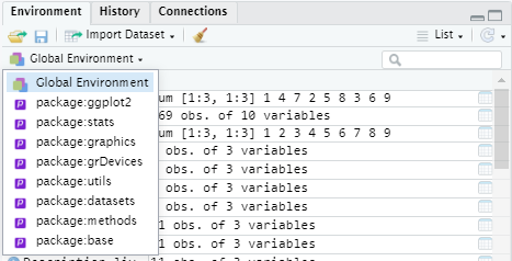
Wait until the STOP sign disappears, and the > sign appears again in the Console, before running the next line of code. Before a new package can be used in the current script, you need to load it into the R environment by using the library() function. You need to do this every time you open a new environment. You install the package once, but you load the package every time you use it in a new environment. To see which packages are loaded in your environment, you can click on ‘Global Environment’:
To load a package, use the following function:
library("ggplot2")For every package you use in a script, it is useful to load the
packages at the start of your script. When you open your script again in
a new environment, you can run these library() commands
first, to load all necessary packages again before starting your code
(as the packages need to be loaded to run your code smoothly).
Now try to do the same for the NHANES dataset. Import
the package and then import the data with the data()
function.
3. Plotting basics
In this COO, we will only use base R plotting functions. To find information about each plot type, you can use the ‘Help’ function, but there are also many online resources. A great resource that shows the basics and more advanced possibilities with plots in both ‘base R’ and ‘ggplot2’ is The R Graph Gallery. They provide many examples on how to produce and customize graphs.
You can navigate through the R graph gallery yourself to find information on different types of graphs. Look around on the website to see what types of graphs you can make with R. Under ‘chart types’ you can select the type you are interested in. If you scroll down, you will see that for most chart types there is a ‘GGPLOT2’ section with examples, and a ‘BASE R’ section.
3.1 Scatterplot
Look up the scatterplot and click under ‘BASE R’ on the first graph ‘Most basic scatterplot’. On this page you can find some information on the use of scatterplots. On the top of the page there is often a link to ‘DATA TO VIZ’, a website that provides information on how to select the right type of graph for your data. If you scroll down you see an example script and some information on how to customize your graph.
Let’s make a scatterplot ourselves. We want to display the
relationship between the height and age of people in the
NHANES dataset.
First, we need to select the correct columns. Remember that to access
variables from a dataframe you can use two methods: the square brackets
[ , ] or the dollar sign \$. In the previous
COO you’ve learned to select the first row of the people dataframe with
df.patients[1,], and the first column with either
df.patients[,1] or df.patients$Patient_ID if
you know the name of the first column.
4. Select the age column of NHANES with the
dollar sign ‘$’. If you can’t remember the name of the
column, you can of course use the head(NHANES) function,
names(NHANES) or help(NHANES).
The output in your console should show the values in the age column (this example is capped to the first 100 values):
##   [1] 34 34 34  4 49  9  8 45 45 45 66 58 54 10 58 50  9 33 60 16 56 56 57 54 54 38  8 36 44 44 64 26 59 59 49 51 51 17 12 12 16
##  [42] 16 16 16 28 37 28 32 25 21 21  8  8 44 56 78  3 58 58 58  1 13 27 31 31 29 29 29 11  6  6 56 56 16 30 26 26 26 30 54 54 54
##  [83] 29 29 29 29 17 17  9 80 80 13 50 26 58 80 35  7  8 12
For our scatterplot, we will plot the age on the x-axis and the height on the y-axis. For other columns, this command would look like this:
plot(x = NHANES$Age, y = NHANES$Height)5. Make a scatterplot that shows the relationship between the height and weight of the people in the NHANES dataset.
The plot viewer should show this:
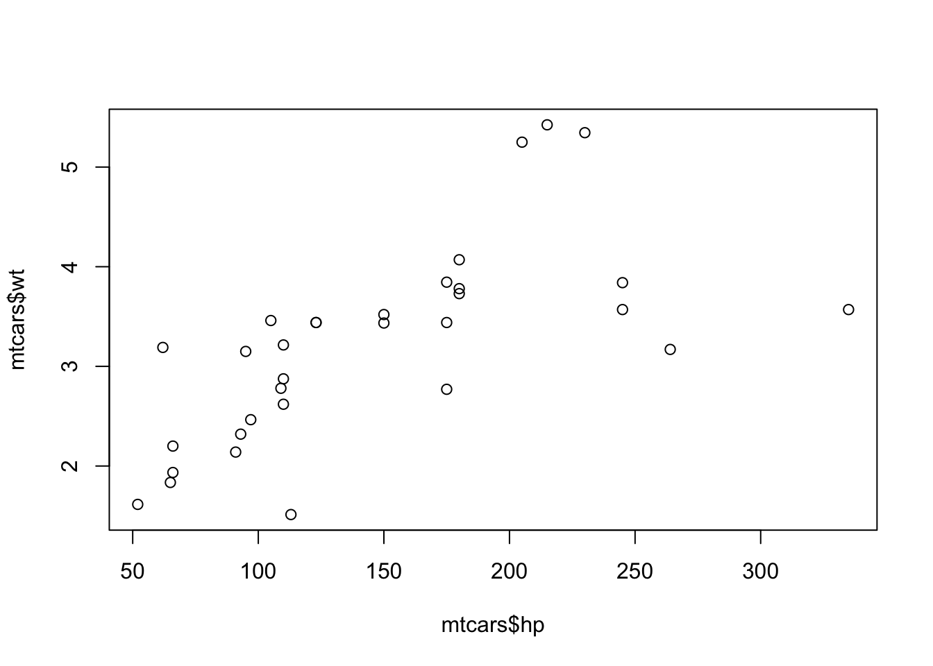
You can view a larger version of the plot when you click in the plotviewer on ‘Zoom’. You can scroll through the plots you created in an R session with the arrows next to the zoom function.
By extracting a column of a dataframe, we are actually getting a vector (a set of values of the same data type) of values (in this case numerical values). A traditional scatterplot can only be made of two vectors with numeric values plotted against each other.
Let’s try to make a scatterplot of a whole data frame and see what happens.
6. Make a scatterplot of NHANES columns 17
through 21 (this could take a bit). What do you see in the plot viewer?
Can you explain what you see?
plot(NHANES[, 17:21])7. Where in this new plot can you find the plot we made before (with height on the x-axis and weight on the y-axis)?
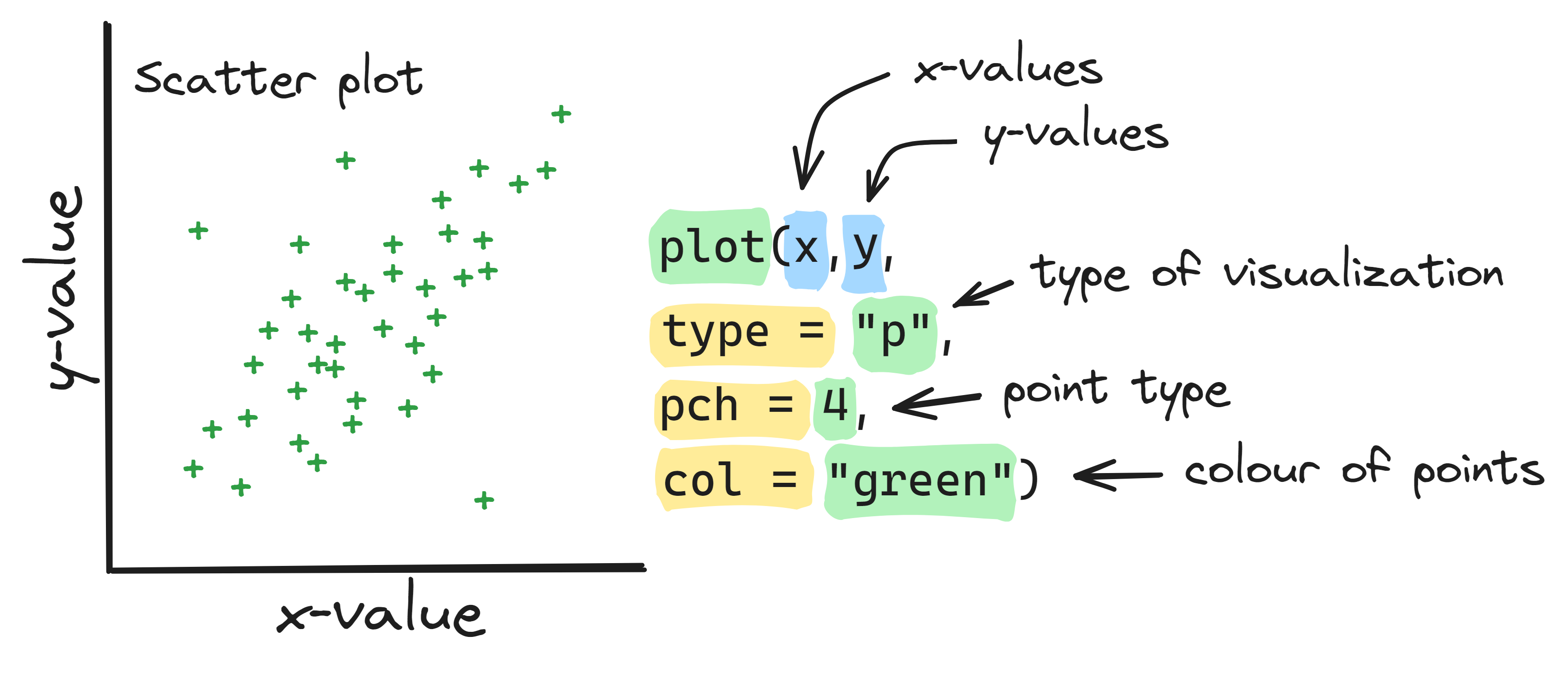
Info graphic about basic scatter plots:
We can also use the plot() function to create line
graphs. We use the type = "l" argument.
Note, use the ‘l’ from ‘line’, not ‘1 (one)’.
8. Make the following line graph. Explain what each part of the code does.
Chick1 <- ChickWeight[ChickWeight$Chick == 1, ]
plot(Chick1$Time, Chick1$weigh, type = "l", main = "Chick 1 weight over time")
3.2 Barplot
With the scatterplot we compared the values of paired numeric
variables in a visual manner. If we want to compare the weights (one
variable) of the different individuals (the rows) in the
NHANES dataset in a visual manner, we can use a
barplot.
Look up the characteristics of a barplot and see what it can be used for on the R graph Gallery and Data to Viz websites.
9. Run the code below. Eplain what each part does.
# Creating an example dataframe
name <- c("Tom", "Nadia", "Anna", "Inge")
age <- c(24, 20, 21, 23)
relationship <- c(TRUE, FALSE, TRUE, TRUE)
people.df <- data.frame(name, age, relationship)

# Plotting the ages of the people in a barplot:
barplot(height = people.df$age, names = people.df$name)
As you can see, we use the numerical vector ‘age’ as
height in the function barplot(), and the
categorical value ‘name’ as names for the bars. On the R
graph Gallery website they used similar code for the ‘Most basic
barplot’. You could also try their code by copy-pasting it to your
script. If all goes well, you should produce the same graph as is shown
on the site.
Let’s try to barplot the whole people dataframe, just like we did
with the scatterplot and the NHANES dataframe.
Run the following code:
barplot(height = people.df)You will get an error message in your Console:
Error in barplot.default(people.df):
‘height’ must be a vector or a matrix
You get this message because we used a dataframe for the argument
height of the function. If you get such error messages and
do not immediately understand what you did wrong, you can try to find
the answer in the ‘Help’ panel. An explanation of how to read the ‘Help’
panel can be found here.
Another option for finding more information on an error message is of
course to Google it or ask ChatGPT. However, be aware that many websites
require more than a basic understanding of R programming to be of
use.
10. Now, make a barplot of the height of the patients in the
NHANES dataset. Don’t forget to assign names with the
names = NHANES$ID format.
# Convert NHANES into a data.frame if it's not already a data.frame !!!
NHANES <- as.data.frame(NHANES)
11. There are so many patients, that you can’t see all the
labels on the x-axis. So, let’s make a barplot of the height of the
first five patients in the NHANES dataset. Use the
NHANES[row numbers, column number] command to select the
correct data. Don’t forget to assign names with the
names = NHANES[row, column] command.
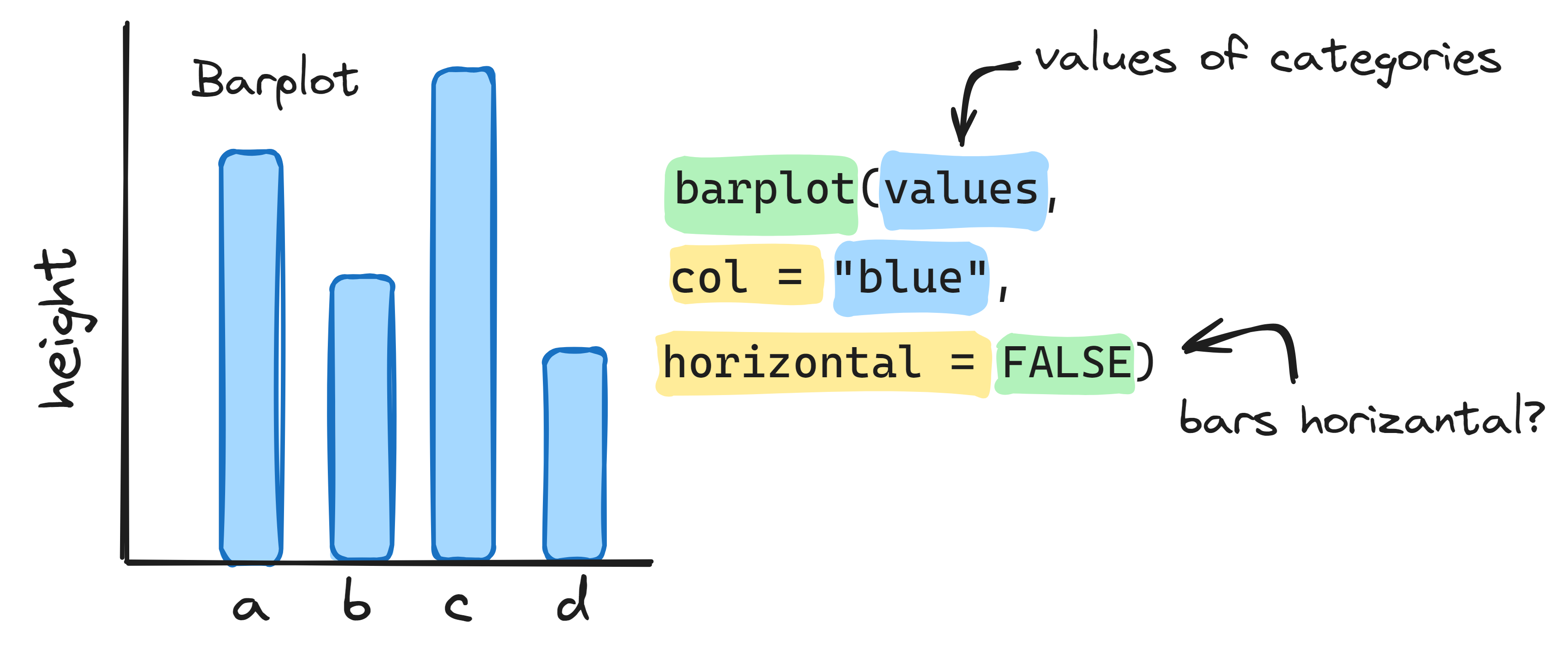
Info graphic about basic bar plots:
3.3 Histogram
So, a barplot shows the numeric value (length) of each categorical value (patient) as a bar. Now, we want to know the distribution of the ages in this dataset. Therefore, we can make a histogram or a boxplot. We will make both, but start with the histogram. Start by reading the info of the Data-to-Viz website on histograms (Data-to-viz).
To make a histogram of the lengths of the patients in
NHANES, you can use
hist(x = NHANES$Length).
12. What is the default interval that is used to cut the variable weight into bins? If you don’t understand how you can deduct this from the graph, look at the apartment example of Data-to-Viz.
13. What does the fifth bin from the left tell you?
With the hist() function we can also change the binsize
(width of the bars). We can either determine the number of bins or the
breakpoints, with the function argument breaks =. Let’s try
out different bin sizes for a simple dataset. With the following code,
we draw numbers from a normal distribution, then we plot them with
default settings, and then we change the number of bins to
50.
normal1 <- rnorm(1000)
hist(x = normal1)
hist(x = normal1, breaks = 50)
As you can also read in the ‘Help’ section about hist().
If you provide a single number for breaks, it is used as a suggestion.
The breakpoints will be set to ‘pretty’ values. So, in our example, 41
bins are used, with breakpoints every 0.2. You can also define these
breakpoints yourself. Therefore, it might be useful to know the minimum
and maximum of the numeric value you are plotting. Then, you can
determine the breakpoints of the bins with the seq()
function.
14. Determine the lowest and highest value of the created
vector normal1 with the functions introduced in a previous
COO.
15. Determine the breakpoints you want to use. Plot the
normal1 vector in a histogram, and set the breakpoints by
adapting the following command:
hist(x = normal1, breaks = seq(from = -6, to = 6, by = 0.5))16. Try some different breakpoints, until you find a option that, according to you, best represents your data. N.B. There are different statistical rules to determine the binsize, for example Sturges formula or the Freedman-Diaconis rule. This is beyond the scope of this introduction to R.
Info graphic about histograms:

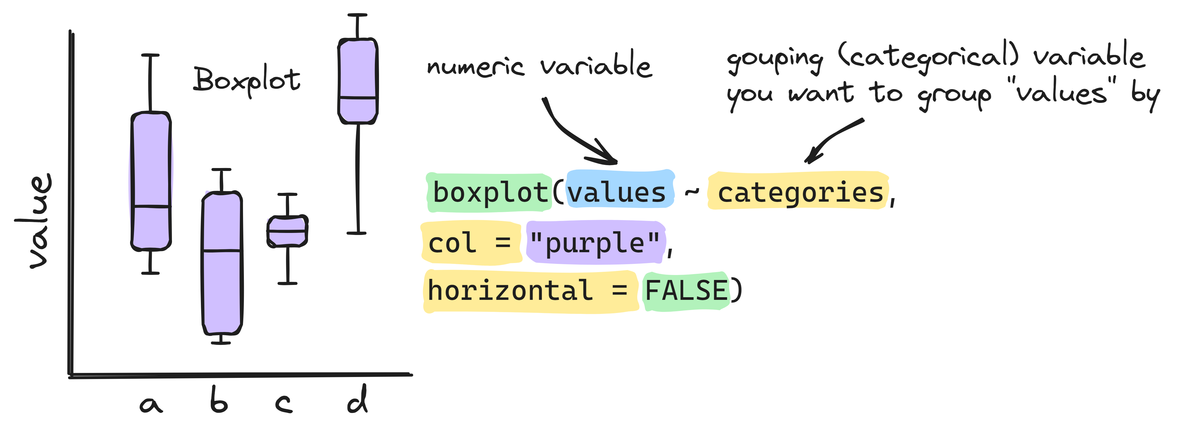
3.4 Boxplot
You can also visualize the distribution of numeric data with a boxplot. Read about the boxplot on the Data-to-viz website.
17. Make a boxplot of the normal1 vector with
the following command:
boxplot(x = normal1)The advantage of a boxplot over a histogram is that you can easily visualize multiple datasets in one graph. Let’s visualize a few normal distributions. Therefore, we first need to make additional vectors and put these together in a matrix or list. Do this with the following commands:
normal2 <- rnorm(1000, mean = 3, sd = 1)
normal3 <- rnorm(1000, mean = 4, sd = 2)
normal4 <- rnorm(1000, mean = -2, sd = 0.5)
normal.matrix1 <- cbind(normal1, normal2, normal3, normal4)  # cbind puts each vector in a column of a matrix
normal.list1 <- list(normal1, normal2, normal3, normal4)
18. Make a boxplot of the normal.matrix1 and
normal.list1. What difference do you see?
Another difference is that with a list you can store vectors of different lengths (and different data types). So, when you would like to compare vectors of numeric values with different lengths in a boxplot, you can create a list. For example:
normal5 <- rnorm(100, mean = 7, sd = 1.5)
normal6 <- rnorm(500, mean = 7, sd = 1.5)
normal7 <- rnorm(300, mean = 4, sd = 2)
normal.list2 <- list(normal5, normal6, normal7)
boxplot(normal.list2)
We can also make boxplots of our dataframe. We can either plot the
whole dataframe, or select the columns we want to plot. Our
NHANES dataset has only few comparable numeric variables,
so plotting all of NHANES in a large boxplot makes
little sense.
To make a better visualization of these variables we will look at a
subset of the greater dataset. To select multiple columns, we can use
NHANES[, 17:21].
19. Make a boxplot of a select few columns from the
NHANES dataframe.
boxplot(NHANES[, 17:21])When you want to visualize many boxplots, you can also display them
horizontally with the boxplot() function, using the
argument horizontal = TRUE.
20. Now make a horizontal boxplot.
21. What happens when you plot a categorical variable, such
as MaritalStatus, in a boxplot? Does it make sense to make
such a boxplot?
boxplot(NHANES$MaritalStatus)There are other ways to use categorical variables in a boxplot. With the following code, you can make a Testosterone box for each category of Gender:
boxplot(Testosterone ~ Gender, data = NHANES)Info graphic about basic boxplots:
3.5 Heatmap
Now, we have seen several different graphs: 1) A scatter plot, to visualize the relationship between two numerical variables, 2) a barplot, to show the relationship between a numerical and a categorical variable , 3) a histogram, to study the distribution of one numerical variable (weight), and 4) a boxplot, to summarize the distribution of numerical variables of several groups (for instance all columns of a dataframe).
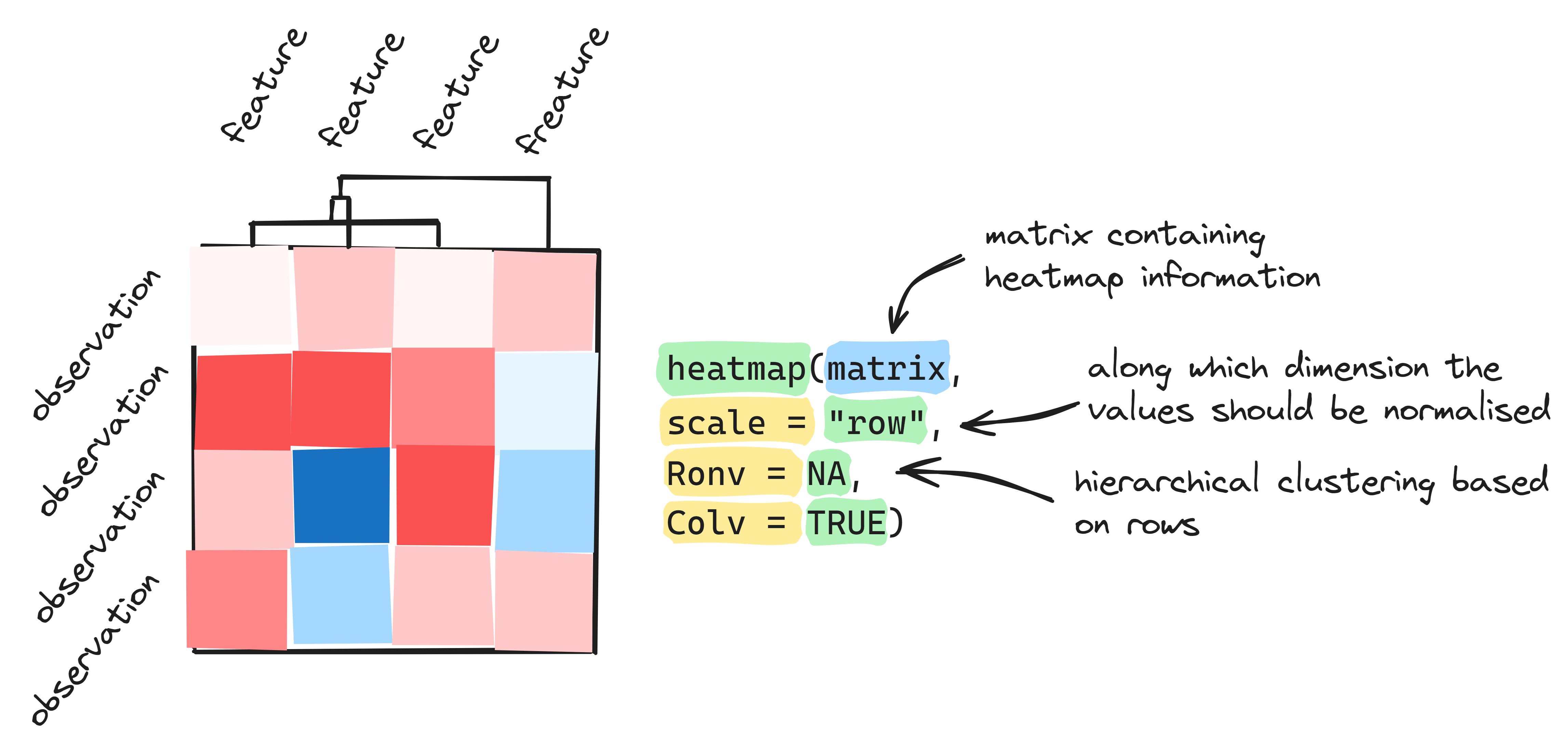
The final graph type we will explore is the heatmap. This graphical representation is often used for gene expression data, because it provides a quick, visual overview of all data points. In the most basic version, each numerical data point (table cell) in a matrix is converted to a color, corresponding with the size of the value. So, on a scale from yellow to red (the default in base R), in a dataset with values from -10 to 10, yellow would correspond with -10, and red with 10. Values in between are displayed in shades of orange.
A heatmap requires a data structure containing only numerical data.
Therefore, the function heatmap() requires a numeric matrix
for the argument x. If we want to visualize a data frame as
a heatmap, we first need to convert it to a matrix. Load the
msleep dataframe with the data() function.
Note: msleep data is part of the ggplot2 package you
installed at the beginning of the COO. To make a heatmap all values in
the dataframe need to be numerical so you will need to select all
columns with numerical data and then create a matrix.
22. Select all numerical data for the msleep
data frame, remove the ‘NA’ and create a new variable ‘matrix.msleep’
with this command.
data("msleep")  # Import the data
msleep_num <- na.omit(msleep[, 6:11])  # Extract only the numerical data
matrix.msleep <- as.matrix(msleep_num)  # Convert it to a matrix

# Add rownames to the matrix !!!
rownames(matrix.msleep) <- na.omit(msleep[, c(1, 6:11)])$name
The default of the heatmap() function is to already
normalize and reorder the data. Normalization is done to make the
variation in rows or columns comparable. Reordering is a computation
that tries to order the observations in each row and column by
similarity.
Let’s first take a look at the data without normalization.
23. Make a heatmap with the following command:
heatmap(x = matrix.msleep, scale = "none", Colv = NA, Rowv = NA)We can see that the columns ‘bodywt’ contains relatively high values. This causes the other columns to display yellow values only. Therefore, it is useful to normalize the data, to make the variation between columns comparable.
We can determine the normalization by using the argument
scale in the function heatmap(). In the
example above, we used scale = "none", which means the
values are not normalized. You can read in the Help section
about heatmap() that the default of the argument
scale is row, which means normalizing to make
rows comparable. We know that the variation between columns is bigger,
and therefore we need to adapt our code to scale by column.
24. Create the same heatmap as above, but change the argument scale to “column”. Don’t forget to use the quotation marks, to make it a character string. You can also try what happens when you scale by row.
The default of the heatmap() function is also to reorder
the data. Reordering can be done for rows and columns separately. We can
set the reordering of both columns (Colv) and rows
(Rowv) to NA (not available) if we do not want the
heatmap() to reorder. Set them to TRUE, or
leave these arguments out, if we do want to reorder by both column and
row.
25. Create the same heatmap as above, but let the heatmap reorder by row and column.
heatmap(x = matrix.msleep, scale = "none", Colv = TRUE, Rowv = TRUE)

# heatmap(x = matrix.msleep, scale = "none")
26. In how many groups would you divide the variables (horizontal axis)?
27. In how many groups would you divide the animals?
The heatmap can give an indication of the correlation between different variables. For example, we can see that the variables ‘bodywt’ and ‘brainwt’ are positively correlated. When the bodyweight of an animal is low (yellow), the brainweight is most likely low as well. These variables, on the other hand, have a negative correlation with ‘sleep_total’. We can check these correlations in more detail with another plot type.
28. Create a plot that displays the correlation between bodywt and brainwt.
29. Create a plot that displays the correlation between bodywt and sleep_total.
30. What correlation do you see between brainwt and sleep_cycle in the heatmap? Create a plot that displays this correlation.
31. What do you expect about the distribution of the variable sleep_rem based on the heatmap?
32. Create a plot that displays the distribution of the variable sleep_rem.
33. Take a look at your latest heatmap again. Are there other variables for which you expect a similar distribution?
34. Create the plots that provide an overview of the distributions of all the variables of the msleep dataset again.
You can see that some boxplots may not have whiskers (the lined
extending from the boxes), which could indicate that the variable does
not contain many unique values. We can check this for each variable with
the following function unique(dataframe$columnname). This
function returns a vector with the unique variables that can be found
within a column.
35. Determine with the heatmap, distribution graphs and the
unique() function which variables contain a low amount of
unique values.
Info graphic about heatmaps:
4. Saving plots
Now that we’ve made some plots, we want to be able to save them as well. There are different ways to save plots in RStudio. An easy way is by clicking the ‘Export’ button above the plot in the ‘Plots’ panel of RStudio. You can then choose to save it as image or PDF, or copy it to your clipboard. When you choose to save it as an image, you are asked to choose an image format.
There are many formats you can use to save an image, which you can recognize by de file extension (for example ‘.jpeg’). To understand which image format is suited for which application, it is firstly good to realize that there is a difference between raster and vector images. Raster images save the information in the image as a series of pixels. When you stretch the image, and thereby the pixels, they can become distorted and the resolution is compromised. Therefore, you best save pictures in the size you need. You can change the size of the image while saving in RStudio. Vector images, on the other hand, are far more flexible. They are saved as a formula that can recreate the image. You can use these image files to create images you would, for example, like to use both in a paper and on an A0 poster. When you enlarge the image, no information is lost.
Some commonly used file extensions are:
- .jpeg (or .jpg): a raster format that compresses the file to create small-size files. During this compression image details are lost. Often used for images on the internet and photo cameras, because of the small file size.
- .png: a raster format that uses compression without losing detail. Not suitable for printing, because they still have low resolution, but does work for the internet, because they load quite quickly.
- .tiff: a raster format that uses compression without losing detail. A very rich format that contains a lot of detailed image data, can contain different types of color palets (grayscale, CMYK or RGB), and can save other info (like layers and image tags). TIFF images are usually very large and take longer to load.
- .svg: a vector format that does not compress images. It is XML-based (used to save and structure data) and often used for logos and graphs.
- .eps: a vector format that does not compress images. Very suited for high-resolution graphics for printing. You can open and save .eps files easily with many design software (for example Adobe Illustrator).
36. Save one of your plots as PNG, TIFF, EPS and PDF. What are the sizes of each of these files?
Another way to save your plots is by coding the command. Therefore, you must first indicate where you want to save your image. Remember that you can access a file by creating a character string that contains the whole file path including the name and the extension of the file. In the same manner, you can save a new file. If you copy the working directory path from your ‘Windows Verkenner’, don’t forget to convert the backslashes () to normal slashes (/). If you have already set the working directory previously, you can save by just specifying the file name and it will be saved directly in the folder that has been set as the working directory.
37. Set the working directory. Save a plot using the following commands:
tiff("myfilename.tiff")  # To save the plot in the folder prespecified as working directory
tiff("C:/folder1/folder2/myfilename.tiff")  # To save the plot in another folder, specify the entire file path
heatmap(matrix.msleep, scale = "column")
dev.off()
As you can see, you first determine the file format and file name.
Look up which file formats you can save in the same manner, with
help(tiff). Then, you plot the plot you want to
save. And you always end with the command dev.off(), which
closes the file. If you forget this command, the file remains open and
the next plot will be saved to the same file. Only when you close the
file with dev.off(), the new file will appear in your
folder.
38. We advise to use PNG files for figures for your lab journal. Save a plot in the PNG format using the commands above.
5. Plotting customization
The plots we’ve made so far are not really visually attractive. Luckily, we can change many visual characteristics of the plots with extra arguments in the functions we use to plot. We will now try out some of these customization options. In all of the following exercises, we encourage you to try out some different values and play around with it a bit, to get an idea of all the possibilities. You can find more info about customization on The R Graph Gallery again, under ‘QUICK’ in the menu bar. The last three tabs are useful for base R. We will start with the scatterplot (plot()) again. You can also find info on customizations at the page for the basic scatterplot.
We will use the scatterplot of msleep displaying the relation between remsleep and brain weight as an example.
39. Change the x- and y-limits of the axis with the following commands:
plot(x = msleep$sleep_rem, y = msleep$brainwt,
     xlim = c(0, 8),
     ylim = c(0, 2)
     )
To keep all of the arguments in the function readable, we can put each argument on a new row. RStudio will automatically align the next argument directly below the first argument.
We can also create a title for the graph and change the axis titles.
40. Create meaningful titles by adapting the following commands:
plot(x = msleep$sleep_rem, y = msleep$brainwt,
     xlim = c(0, 500),
     ylim = c(0, 400),
     main = "My plot title",
     xlab = "My x-axis title",
     ylab = "My y-axis title"
     )
41. Now, change the shape, size and color of the markers respectively, with the following commands:
plot(x = msleep$sleep_rem, y = msleep$brainwt,
     xlim = c(0, 8),
     ylim = c(0, 2),
     main = "Msleep dataset",
     xlab = "Rem sleep (hours)",
     ylab = "Brain weight (kg)",
     pch = 8
     )

plot(x = msleep$sleep_rem, y = msleep$brainwt,
     xlim = c(0, 8),
     ylim = c(0, 2),
     main = "Msleep dataset",
     xlab = "Rem sleep (hours)",
     ylab = "Brain weight (kg)",
     pch = 8,
     cex = 2
     )

plot(x = msleep$sleep_rem, y = msleep$brainwt,
     xlim = c(0, 8),
     ylim = c(0, 2),
     main = "Msleep dataset",
     xlab = "Rem sleep (hours)",
     ylab = "Brain weight (kg)",
     pch = 8,
     cex = 2,
     col = "red"
     )
You can find the different shapes with Help(pch) and a
list of the names of possible colors with colors(). Try out
some different shapes, sizes and colors if you like. You can select a
color in multiple ways:
- by using its name as a character string:
col = "red" - by selecting a color from the list:
col = colors()[625] - by using a number directly:
col = 5(very limited) - by defining the rgb numbers:
col = rgb(0.7, 0.4, 0.8) - by defining the Hex code:
col = "#00A514" - by using a function, for example 10 colors of the function rainbow:
col = rainbow(10)
The use of colors is particularly useful when you plot two or more
variables in one plot. We will try this out with the histogram. To add a
plot to the existing plot, you can use the argument
add = TRUE.
42. Plot two normal distributions with the following commands:
normal1 <- rnorm(1000, mean = 1, sd = 2) #creates new vector with normally distributed numerical values
normal2 <- rnorm(1000, mean = 3, sd = 2)

hist(x = normal1, breaks = 50,
     col = rgb(red = 1, green = 0, blue = 0),
     xlim = c(-15, 15),
     ylim = c(0, 100)
     )

hist(x = normal2, breaks = 50,
     col = rgb(red = 0, green = 0, blue = 1),
     add = TRUE
     )
Now, the blue histogram is overlapping the red one. We can make the
colors transparent with the argument alpha in the function
rgb. The first three arguments in rgb() are
red, green and blue, respectively. The fourth value is the alpha
(transparency). Above, we use the full argument names, but you can also
use the values only: rgb(1, 0, 0, 0.5).
43. Plot the two normal distributions again with transparent colors, by adding ‘0.5’ as the alpha.
To make the plot interpretable for others, let’s add a legend. To
achieve this, utilize the legend() function, placing it on
a new line following the plot creation code. The arguments in this
function are x for the location of the legend and
legend to define the items of the legend. For
x you can use a character string (with quotation marks)
from the list: bottomright, bottom, bottomleft, left, topleft, top,
topright, right and center. For legend you can use a vector
like c("first", "second") to define the different variables
in the plot, and fill = c() to define the colors of the
legend.
For clarification: to make a plot with a legend, you use two
functions, each with a set of arguments. So, first you use the
hist() function with different customization arguments, and
then on a new line, the legend() argument, with three
arguments. Within the function legend() there’s an argument
legend =. In this argument, you use the function
c("first", "second") to provide the text for the legend.
So, the complete argument is:
legend = c("first", "second"). You can find an example of a
legend on the histogram
page of The R Graph Gallery.
44. Add a legend to the plot with these instructions.
6. Visualization pitfalls/lies
7. Optional
If you have time to spare, try out this optional last part of the COO.
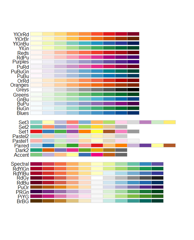
Now, let’s optimize our heatmap. The color scheme used by base R is from red to yellow. However, this is not very pretty. While deciding which colors to use in a graph, you should try to find a combination that is color blind-friendly as well. Color blind people tend to have difficulties with the following combinations: red-green, green-brown, green-blue, blue-gray, blue-purple, green-gray, green-black and light green-yellow. Therefore, the often-used gene expression scheme with green for downregulation, black for no change and red for upregulation is not particularly color blind-friendly. A scheme that is also used for differential gene expression and far better, is the blue-white-red scheme.
In addition, it is customary to use a sequential scale (different shades of a single color) for values that vary between 0 and higher, and a diverging scale (different shades of two colors, in two directions) for values that vary around a midpoint (for example zero). So, if you want to display raw transcripts per million (TPM) data, use a sequential scale (for example white to dark blue). If you want to display differential gene expression, use a diverging scale (for example blue to white to red).
There are useful color palets in the RColorBrewer package:
If the RColorBrewer package is not installed or loaded into
your environment, use the install.packages() and
library() functions to install and load it.
You can use this package in the following way:
heatmap(matrix.msleep, scale = "column",
        col = brewer.pal(n = 9, name = "Blues"))
In the function brewer.pal you select the number of
different colors in the palette with the n argument, and
the palette with name. You can choose from the palette
names displayed above.
To add a legend, you need to define the elements in the legend like
we did above, with the argument legend of the function
legend(). In addition, we need to define the colors we want
to display in the legend. Therefore, we will use the argument
fill. We will obtain these colors from the palette as well.
We will use the same function
brewer.pal(n = 9, name = "Blues"), but now we need to
select three colors to display. We can do this with the function:
colorRampPalette()(3) and then, between the empty brackets
we specify the brewer.pal function.
45. Create the heatmap as shown above and add a legend with the following commands:
legend(x = "topleft", legend = c("low", "average", "high"),
       fill = colorRampPalette(brewer.pal(9,"Blues"))(3)
       )
We can also create our own color palette (blue-white-red) with the RColorBrewer package:
mycolors <- colorRampPalette(colors = c("blue", "white", "red"))We can use this new variable (mycolors) as a function to
create a list of colors varying from blue, via white, to red. The
function will contain Hex codes to define colors. And, since the
function contains a list with indices, we can select particular colors
with the command mycolors()[1]. This is very useful for
selecting colors for the legend.
46. Create the mycolors function and make a list
with 256 colors using:
mycolors(256)47. Create a heatmap with our new color palette, using
col = mycolors(256).
48. Add a legend with the following commands: We select the first, middle, and last color of our mycolors function for the legend, by selecting these from the function with the index operator.
legend(x = "topleft", legend = c("low", "mid", "high"),
       fill = c(mycolors(256)[1], mycolors(256)[128], mycolors(256)[256]))
49. Now, create a similar heatmap with a color palette from
"dodgerblue3", via "lemonchiffon2" to
"red4", using 128 colors. In the legend, select the low,
mid, and high value again. Save the plot, using commands, as a tiff
image.
Try out some different graphs and graph customizations. Use the ‘Help’ panel and The R Graph Gallery for inspiration.
If you have finished this COO early, you can take the time to explore the plotting functions in the ggplot2 package as well. These are very useful for presentations, posters and research reports in the future.